
Hello, readers!
It‘s an unusually warm day here, almost like some reverse Indian summer. It’s almost lovely, but feeling this volatile weather while reading the news… ouch. Well, back to books, for now!
You’ll find just two items below on a similar topic — one is a long read, and the other is a bit about what I‘ve been doing in my free time since Christmas ;-) Also, the first version of next-book annotation UI is nearly finished, so I hope to share it with you very soon!
Have a great February!
— Jan (jan@next-book.info)
P.S. If you think this could interest some of your friends, please hit the forward button. Thanks! <3
The interaction design is based on the research from Masaryk University — there’s a bit cryptic brief on our web, but we’ll work on making it detailed after the basics are implemented.
1. The Reflowable Ebook
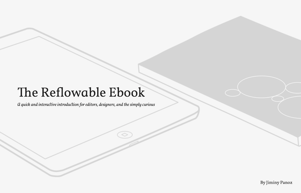
The Reflowable Ebook is a beautifully written and set text about ebook design from 2017 by Jiminy Panoz (@JiminyPan). In case it’s too long for you, there’s even a “Mode Scan” toggle that highlights the most important ideas.
It goes right into one of the epic rap battles in digital publishing — “what about these pages”? (Seriously, try googling “fixed layout” and browse the arguments.) Three years is not a long time in the industry, so the text reads fresh.
You have to look at things differently, lose certain habits, Re-think the usability of the printed object for the screen, create new design methods adapted to the constraints of this new medium…
As the web has already gone through this, we can draw an important lesson from it: we have to embrace the idea that All the solutions of reading are not equal in support and technical possibilities. (…)
There is hope but it will require knowledge sharing, a lot of user research and, above all, a collective effort.
And it’s a good intro story for the other thing I want to share today.
2. Static text for focus
I agree that emulating paper books in digital became weird long ago — Apple’s iBooks came right as a prime example of then-hated (and frequently misunderstood) skeuomorphism.
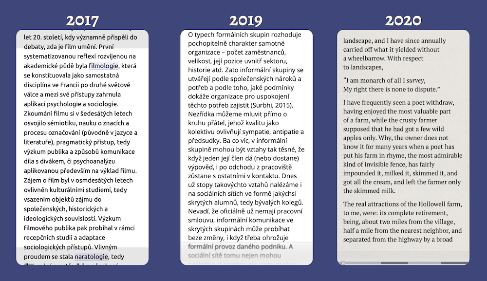
Though, some valuable bits are lost when going for fluid (aka reflowable, responsive) layouts. One of these is the spatial memory related to the layout. As in “It’s been on the bottom left! BUT WHAT!” while writing a test back in school. It works on paper, it works with PDF, but it’s gone once you create a normal web page. I don’t know what to do about this one — and I haven’t even try to read up some research yet.
Another bit is the focus that is lost when scrolling — reading while scrolling is just one tiny step from skimming. And it’s not only my impression — science connects scrolling (as mentioned previously) to lower reading comprehension. Hence, we wanted to have some kind of “page step” in next-book, but it’s a hard thing to do with a continuous text.
We tried various approaches to retain the benefits of “pagination” while staying true to web UI conventions. And we may have nailed it this time finally.
The idea has always been to avoid scrolling when focusing on reading so that you can continue on the first line when “finishing a page,” but when you need it, scrolling is there for you.
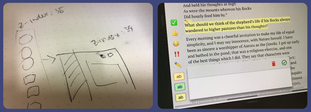
The first next-book prototype had two vertical stripes so that a reader could see the continuation of the text — we drew inspiration from the vanished practice of using “catchwords“. It originated as a tool for bookbinders, but readers found it useful too.
Later we dropped the top bar to make it less weird (even then, our team member Lukáš thought it’s an adblock-related bug in our first round of internal testing).
It might look similar, but in practice it’s night and day.
The new idea uses a trick to hide the lines on top and bottom completely — but only when using the “pagination” buttons and actions. When scrolling, it becomes a page like any other.
You can try it out on an improved test page, but I’m already testing this in a real book, and it just works.
The first prototype I cobbled together over one Christmas evening.
See you in two weeks!
Well, that’s it for today. What are the other things you miss in digital books? Feel free to reply to this e-mail :)
I’ve been experimenting with mobile screen recording, so perhaps there’ll be a more thrilling demonstration of our breakthroughs down the line :-)